Monday, April 4, 2011

Just say "no" to . . .

BLACK TIGHTS!

And "yes" to colored tights! So many colors to choose from this season.
I chose violet yesterday and got tons of compliments!


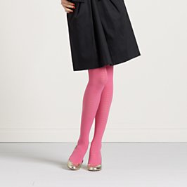
mod dot tights

I love these pink "mod dot" tights from Kate Spade.


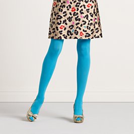
very opaque tights

And these "very opaque" teal tights, also from Kate Spade.


My friend Jeanne posted some great suggestions on her blog recently too. What color do you dare to try? Do let me know!

Happy Monday friends!

Saturday, April 2, 2011

Oh, lolly, lollypop!

lollypop
After yesterday's rather heavy post, I feel compelled to lighten things up with some happy images for the weekend. This yummy “lollypop” glassybaby makes me want to start singing “Lollypop, lollypop, oh, lolly, lollypop!”


And to lick a grape lollypop!


 And eagerly anticipating allium bulbs blooming in my garden - soon!


Happy weekend friends. Have a great one!


Friday, April 1, 2011

Sweet, Mysterious Violet


I did it. I picked this purple hellebore on my walk in the Arboretum on Sunday morning. I know, it's taboo, but I had to pick it. I think it is the same bloom I was taken with a couple of weeks ago when the first signs of spring were brightening our world.


Once again, on Sunday morning, I had a busy mind, fidgeting with my endless to-do list and things I wanted to get done that day. Instead of my usual neighborhood route, I detoured and decided to take a path on the outskirts of the Arboretum and I came across this lovely nature trail that drew me in. I’ve walked it many times over the years, but right now it is so lush and green, and I felt drawn to go this way.

And, once again, I felt an urge to focus on a color as a way to calm my thoughts and focus my energy. Sunday’s color was violet. Pantone calls it Hyacinth Violet.

It is the color of the seventh chakra (or energy center), located at the crown of the head. The seventh chakra is our connection to our higher energy source, a God source, a sense of oneness, and belonging, a divine wisdom and openness to embrace life. I learned in a recent color energy workshop I took that violet’s color energy supports art and beauty. Aaah, now I see why was drawn to it.

All along the path I looked for my color of the day. The path was mostly green but at the end was a field of deep violet hellebore - like a pot of gold - waiting there to delight me and teach me. I picked a sturdy, beautiful bloom and studied it all the way home. It has lines running throughout the petals, like the palm of a hand. I decided it could possibly be the perfect flower. At least from appearances. I looked up the meaning of the hellebore when I got home and found out that the ancient Greeks associated the flower with demons or possessions, and that all species of the flower are toxic. Hmm, not so perfect after all. (Yes, I washed up right away!) Strangely, it is also said to provide protection, and a vase of hellebore brought into a room will drive away an unpleasant atmosphere and replace it with tranquility. I like that!

After my walk, I dashed to church. I was a few minutes late because of where my walk took me. After finding a seat with a good friend, I immediately noticed that “my violet” was decorating the altar and being worn by the clergy. I emailed the rector after church for an explanation about this coincidence. He replied: “Color is a key component to worship at Epiphany. Here is a website that details how color is used in the liturgical rhythms of the church.” I learned that purple (with violet as an alternate) is a symbol for pain and suffering, and used as the liturgical color for the Season of Lent, the 40 weekdays before Easter. It is also the color of royalty, so traditionally has also been used for Advent.

I have to admit, I am struggling with the different meanings of violet. Some are beautiful and uplifting and others are not so uplifting, suggesting introspection about the mysteries of life. 

This week I started reading The Elements of Color by Johannes Itten, considered one of the greatest teachers of the art of color of modern times. (What a great thing to be known for, huh?!) He devoted more than five decades to the instruction of the visual, psychological and esthetic mysteries of color. So cool!)  After reading the foreward to the book, I went directly to the section on color symbolism and looked up violet. He says violet is "the color of the unconscious - mysterious, impressive and sometimes oppressive.” Again, a little good, a little bad. What does this all mean?

I do have some very sad things going on in my life right now that are weighing heavily on me (a good friend's son was recently diagnosed with Leukemia, another good friend with a brain tumor, and a close relative passed away yesterday from an awful, uncurable disease). In contrast, I feel happy and content and I have a lot to be thankful for.


To me violet is a beautiful, mysterious color. Maybe I am drawn to it for its complexity, and as a reminder of life’s highs and lows and that we must put our trust in a higher being. I obviously still have a lot to learn about color’s influence on our lives, but I’m excited to be on this journey as a student of life.


In loving memory of Maggie O’Brien Mathers

Geoff bought this glassybaby last night and we are keeping it lit in memory of Maggie. Its given name is “luxury” but we renamed it "maggie." She loved glassybaby and had a way bigger collection than me. It was one of the many interests we shared.  She had a very strong influence on my life as a mother, artist, neighbor, landlord, friend and cousin, by marriage. This week, two people asked me how she was doing and asked me to tell her hi. I was planning to walk over and see her this morning while Sofia is at school. I am sad I missed her by one day. I am going to take purple tulips to their house this morning. (I bought some for our house too.) Whenever I visited Maggie recently, she was wearing a gorgeous purple cashmere sweater. I will always remember her kindness, creativity and the advice she gave me, most recently about raising a spirited daughter. Her spirit will live on through her amazing children and everyone who had the honor of knowing her. My heart is heavy....
 

Thursday, March 24, 2011

Wild Sweet Orange


I have a new love! Tazo's Wild Sweet Orange herbal infusion tea. I recently enjoyed it at my in-laws house and bought a box of my own when we got home. It's funny that after working at Starbucks all those years (Tazo is a Starbucks brand) with access to free coffee and tea, that I didn’t discover this delicious, comforting gem. Actually I think I tried it once but it definitely was not love at first sip.

The tea bags are wrapped in cheery orange paper (which I love!) and the description on the box reads "A juicy blend of lemongrass, citrus herbs, licorice root & orange essences." Yum! 

It's caffeine free so it's the perfect mid-morning treat after I am fully caffeinated from my early morning black tea (Harney & Sons Paris is still my favorite), or during my mid-afternoon slump if I can resist caffeine, or after dinner instead of a high-calorie sugary dessert. Be sure to do add a bit of honey to give it some extra sweetness.


I discovered if you drink it out of a clear glass you also get to enjoy the beautiful orange color of this delightful beverage. It almost looks like Easter egg die but it's transparent.

The full description on the back of the box makes it truly irresistible:

"Imagine the invigorating bite of a succulent orange in a Marrakesh market, and you get a sense of TAZO® WILD SWEET ORANGE: multilayered orange flavors with exotic hints of spice and a distinctive, floral finish. It's a blend of blackberry leaves, lemongrass, spearmint, orange peels and ginger that is quite wild indeed.”

Atop the box, a message reads:

"In some places, Tazo is more highly valued than magical pebbles."

I love the unorthodox, non-corporate, mystical Zenness of Tazo!!


As I was taking pictures in my kitchen for this post, my juicy orange glassybaby collection caught my eye.


Speaking of juicy, these little oranges from Trader Joe's are amazingly sweet and juicy and good for you!

 
Pay attention to what catches your eye and your other senses today. The color and magic in our world are pretty amazing if you take the time to see them! Happy day friends. Xoxo.

Monday, March 21, 2011

Happy Spring!

I saw some stunning flowers in the Arboretum last week. I'm loving this deep purple hellebore.

Spring is my favorite season for sure. I have been counting down to the first day of spring - March 20, this year* - since early February. I love the longer days, the fresh scent in the air, spring cleaning, spring fashions and, of course, colorful spring flowers such as peonies, daffodils, tulips, fragrant daphne and pink cherry blossoms.


The March issue of House Beautiful magazine is the Spring Color Issue. The masthead is a bright, juicy orange and the cover story headline reads: "The Power of Pink! It's warm, flattering, sexy (and men love it!)." Well, that got my attention! The magazine's pages are filled with tons of ideas for incorporating pink and other fresh spring colors into your life. As you may recall, I dedicated a whole week in February to writing about pink, so I was tickled (pink!) to see that it is in fact a chic color for spring.


And, did you hear that Pantone designated Honeysuckle as the color of the year for 2011? They describe it as "A Color for All Seasons. Courageous. Confident. Vital. A brave new color, for a brave new world. Let the bold spirit of Honeysuckle infuse you, lift you and carry you through the year. It’s a color for every day – with nothing “everyday” about it." There is oodles of information on the Pantone website about how to incorporate this gorgeous color into your home interiors, spring fashions and more.


The season’s in full swing

And I just had to share this darling image from an Hermès email I received last week with the subject line "Spring into action." It's pretty fun, don't you think? The Hermès orange box is oh so versatile!!


Finally, in celebration of spring I bought these fragrant yellow hyacinths and added some branches of pink quince from my yard for my kitchen counter. And I'm planting some spring annuals in my garden, replacing boots with flats (with no socks, hopefully soon!), finally taking down the Valentine's decorations that my three-year-old insisted on keeping up, wearing colored tights instead of black tights (thanks for the inspiration Jeanne), and taking a photography workshop this weekend.

How are you marking the arrival of the season of renewal?


*The first day of spring, or March equinox, usually falls on March 20, 21, 22 or 23. In the years 2010 through 2017 it will fall on the 20th of March.


Friday, March 11, 2011

Paper Delights-ful!

I was absolutely smitten yesterday after a wonderful visit to Paper Delights in Wallingford. Back in November, my good friends Erika and Sienna gave me a Paper Delights gift card for my birthday. I had been saving it for the perfect occasion to treat myself to some fabulous finds from this delightful paper store that fancies itself in carrying “cards, confections and cravings.” That’s pretty accurate. I love everything in this store from the designer stationary from Kate Spade, Orla Kiely and Martha Stewart, to the yummy sweet confections that match the paper products, to colorful umbrellas (to brighten a rainy gray Seattle day – SO tempting yesterday!) to yummy candles and custom invitations and stationary. DELIGHTFUL!

I was actually in Wallingford for a slightly different reason when I decided to pop into Paper Delights. I was reading a wonderful novel, Pastries: A Novel of Desserts and Discoveries, about a young Indian-American woman who owns a struggling bakery in Wallingford and ends up finding enlightenment at a baking retreat in Kyoto, Japan. Set during the WTO conference in the late 90’s, it’s a wonderful, delicious, romantic read. I was near the end of the book yesterday and I thought it would be fun to finish it in a coffee shop in the neighborhood where it took place. Anyway, I digress, but I did want to put in a plug for the book in case you’re looking for a great (and, at times, mouth-watering!) read.  


Anyway, back to Paper Delights. It is a small, light-filled store run by a mother and daughter duo. They have a great eye for the most delightful of offerings. Here I share some of my favorites with you. Do pop in soon for a burst of spring color, a letter-pressed Mother’s Day card, or a gift card for a friend. It truly is the perfect gift. (Thanks again, Erika and Sienna. Xoxo.)


I love this fabulous wrapping paper!


The Orla Kiely collection - cravings for sure!


Kate Spade style and wit for your correspondence. The pink note cards are engraved with “Tickled Pink.” Too cute!


 Darling, darling cocktail napkins.


A wonderful selection of orange, pink and red goodies.


And green goodies, including pear Jelly Bellies, my fav!


And sweet blues.


And the yellow and gray collection.


And for my selections, from top left - "with thanks" cards by Paper Delights, printed in Wallingford; a bright red and orange zinnia note pad by Snow and Graham; Wallflower notepad from Orla Kiely; and light blue scalloped "hello" cards from Martha Stewart Stationary for Crane & Co.


I was even more smitten when I got home and found a card from my friend, Cathy, in New York in a pink envelope in my mailbox. It absolutely confirmed my passion for the written word, especially hand-written notes.


Happy Friday friends. What does your weekend have in store? Maybe a trip to Paper Delights (or your local version)? We are off to Tahoe for a week of downtime and spring skiing. See you when we return.


Monday, March 7, 2011

Color Clarity

I couldn't believe the intense coloring on this log on the beach.


I love color! Color is my passion, well, one of many. But the common thread that weaves my passions together is color.

What is it about walking on the beach - or anywhere in nature for that matter - that brings clarity and focus?

I took a mini-retreat last week to Whidbey Island (by myself!) to calm my thoughts and enjoy some peace and quiet. As planned, I read, I walked, I ate great food, I read some more, I got an awesome massage (thanks mom!), I saw a movie (The King’s Speech – so good), and I even meditated.


I don't know about you but I always read about the wonderful benefits of meditation but I find it so very hard to do. I even bought an interactive guided meditation kit, aptly titled "Unplug," before I went. It included a book, flash cards offering bite-sized tips to get your meditation practice going, and a CD that literally guides your meditation. I even requested a CD player for my room before I arrived. I was bound and determined to meditate! When I found my room without the requested CD player I decided to let it go and just try meditating on my own, focusing on my breath and letting go. It worked ok but I wasn't totally feeling it.

So I turned back to reading the many things I brought to fill my quiet time - a great novel, the March issue of House Beautiful magazine that is dedicated to color, and information my mom gave me about “The Art of Graceful Transitions.” I also read two handouts from a color energy workshop I attended recently that use color as a basis for meditation to clear the chakras and bring awareness to your mind, body and soul. Am I getting too woo woo for you? Please stick with me because this kind of meditation really works - at least if you love color! (I will share the color meditation technique in a future post, because here I want to share photos from my wonderful time on Whidbey Island.)

As I mentioned, I purchased this meditation kit. Unplug became my mantra for my trip: no email, no cell phone, no TV, no radio in the car…. I literally unplugged.


On Friday morning, I set out for a beach walk after reading about transitions. I learned that there are three main stages of transitions: endings, the neutral zone and a new beginning. I realized that I am in the neutral zone and it feels good! The neutral zone is neither an ending or a beginning, and it is the period of “not doing.” Easier said than done, but I am trying because it is so important to go through this phase.
One of the suggestions for this phase is to take your own time in the wilderness (or the beach),  and avoid distractions and take note of your dreams, where your mind wanders, natural rituals that occur, and patterns in thoughts and memories. And, importantly, have no expectations of your time away. This one is really hard because I felt like everyone (including myself) expected me to come home with some big epiphany about what I am going to do. Although not a big epiphany, I felt clarity as I was walking on the beach that I need to do something with color. It keeps bubbling up and capturing my thoughts and boosting my energy.
Everywhere I looked on the beach I saw beautiful colors.  Literally everywhere. It energized me and excited me. This clarity came from unplugging and being in nature and not doing…. What I am not clear on is what I will do or in what industry? Fashion, branding, color consulting, photography, the arts, who knows? But I am focused on and excited about learning all I can about the fabulous and invigorating qualities of color.

 
I even chose the hotel where I stayed (the fabulous Boatyard Inn) because of the colors, in addition to the great location right on the beach, the price and the lovely innkeepers, Mynda and Annabet, who were so welcoming and allowed me to check in early and check out late.
 
This Native American carving ran the whole length of the bulkhead on the beach at Langley. It captured my attention right away.

And then I began noticing color everywhere, like this bright blue chain on a big log that washed up on the beach.

And bright greem seaweed was everywhere.


From afar I didn't recognize the remains of a Nutcracker. It looked like someone deliberately placed it here next to a big water basin at the foot of the hillside on the beach.


This beachfront cottage was all blue.
The sign in the front yard read Periwinkle Lane. Charming!


I walked about twice as far as I planned down the beach. At one point I became nervous because I realized I didn't know if the tide was coming in or going out. It had be in most of the time I was there. I don't know about you but I don't read tide tables. They are the original Eye Chart. My heart rate quickened and I imagined getting stranded. Then I saw these two read Adirondack chairs way down the beach and I thought “trust nature, trust color.” I immediately felt calm.


Even the white waves caught my attention.


And how about this beautiful heart-shaped purple clam shell?


As if I hadn't discovered enough color, Mynda, the innkeeper told me about this amazing blogger - The Pioneer Woman. I had never heard of her, but apparently she is a national phenomen. Her blog is gorgeous and a bit addictive. Oh and very colorful!


Finally, I stopped in at the 2nd Street Wine Shop to buy a bottle of wine to take to a dinner party back in Seattle. I left with three bottles and I enjoyed wine tasting during the middle of the day. I chose this bottle because of the colorful label!


Thanks for reading. Stay tuned for more color inspirations over the next couple of weeks.